Duke Nukem: Manhattan Project Review

PROS
- A technically accurate reproduction of the original game
CONS
- It feels dated and poorly optimised for touchscreen devices
- Controls suffer due to cluttered and unreliable interface
- Grimy aesthetic looks awful on a retina display
VERDICT
While Duke Nukem: Manhattan Project may be a small piece of gaming history, it feels as unweildy and out-of-date and on modern touchscreen devices as its macho protagonist.
- Full Review
- App Store Info
Duke Nukem: Manhattan Project has always been a game out of time. The original 2002 PC version was delayed by five years, by which time Duke's take on 80's action-movie stars was already D.O.A. Now, the iOS remake stands as a confused anachronism that struggles fit the mobile platform.
Back in the da, Duke Nukem: Manhattan Project's use of 3D to create a 2.5D run-and-gun platformer was worthy of note. The problem is, that twelve years on, the same trick does little to impress.
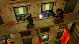
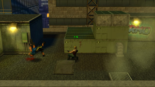
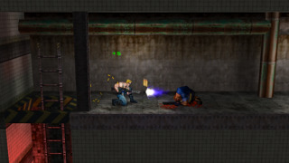
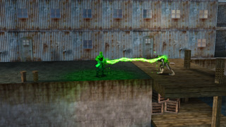
As a direct port of the original, it can't really be faulted - at least in the visual department. Every dirty 2002 polygon is perfectly reproduced, right down to the triangular bosoms of Duke's "babes." But time has not been kind, and leaping around the game's grimy environments feels dull and uninspiring.
The issues don't stop there, though. The incredibly cluttered touch interface struggles to cope to the exacting nature of the action, with the eight directional inputs and four action buttons frequently failing to respond as desired. Again, the grim aesthetic of the world does little to help matters, as making it tough to recognise objective even with the brightness turned all the way up.
The game's optimisation problems are exemplified by the eight-page dialogue box which greets you at you beginning. Perhaps this was once an instruction book, but reproduced on a small screen it is out of place and hard to read.
There is at least one nod to the present state of gaming in Manhattan Project, however. Every time you pause the game, the in-app purchases are proudly displayed. Offering the chance to upgrade Duke's arsenal, this selection of souped-up firepower breaks the game's difficulty curve, and is only really justifiable in light of the poorly executed controls.
Duke Nukem: Manhattan Project was passable when it originally released. Cramming it onto a touch screen device 12 years later has done nothing to boost its limited appeal, and the few changes that have been made do more harm than good.




 $1.99
$1.99


