Bioshock Review

PROS
- It's still BioShock
CONS
- Controls are uncomfortable, especially on iPad
- Visuals have taken a hit, sometimes with negative effects on gameplay
- Lacks atmosphere on small screens
VERDICT
While BioShock remains a fantastic game, its atmosphere and playability have taken a noticeable hit during the transition to mobile.
- Full Review
- App Store Info
BioShock is great.
Deservedly held up as a premiere example of digital world building and interactive storytelling, it's a game which drags you through your TV and submerges you in a nightmarish world of neon and noir.
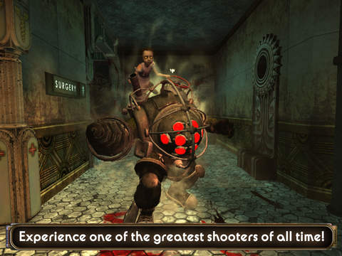
Andrew Ryan's failed utopia, populated with genetically modified maniacs and lumbering, drill-armed childminders, is one of the most atmospheric, immersive, and effectively-realised video game settings ever conceived.
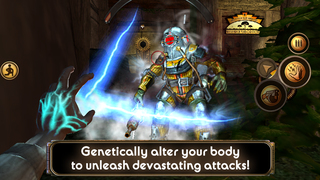
The gameplay elegantly fuses traditional gunplay with an elemental plasmid system, letting you shock an enemy into submission with arcs of lightning before putting them down for good with a well-placed shotgun shell.
The audio logs scattered around the Rapture's leaky husk tell the history of the city's downfall, while a voice in your ear keeps the twisty narrative rocketing along without having to kill the momentum with jarring cutscenes or text dumps.
BioShock on iOS is like a distorted reflection of the original game. It's the full BioShock experience on paper - a direct iPhone and iPad port which shrinks the console classic down a relatively trim 2.5 GBs. It's an impressive feat, and you can't help but admire the technology that allows you explore the whole of Rapture while sitting on the bus.
However, the game's atmosphere and playability have taken a noticeable hit during the transition to mobile. The visuals are plainer - there are no shadows, a there's a distinct lack of lighting and other atmospheric effects. The frame rate is unreliable, with things getting very choppy when you're knee deep in hordes of splicers.
While much this is to be expected, some of the graphical downgrades directly affect gameplay. For example, the red warning beams of the security cameras - which now stutter right and left instead of smoothly panning - often won't be visible, making it far more difficult to see where they're pointing and avoid being detected.
Then there's the controls. 2K China has relegated both the plasmid and weapon selection and trigger buttons to a small panel under your right thumb. While it just about works, it's nowhere near as reliable or immediate as the control pad or mouse and keyboard system.
Using medkits and activating the map requires moving your hand to the top left corner of the screen, something which is extremely awkward when playing on the iPad. Even the new touch-based menu commands appear out of place, often sitting tiny and ungainly amid the original commands.
Don't get us wrong - this port isn't a complete failure. Visual downgrading and control issues aside, this is still BioShock, and players prepared to overlook the technical problems will still catch flashes of the game's original magic shining through the muddy textures.
Still, there's no escaping the fact the game doesn't feel comfortable on a small touchscreen. In reducing file sizes and resolutions for mobile devices, 2K China has sacrificed immersion and playability.
Part of BioShock's strength lay in the little details, the visual and sonic flourishes which made you feel like you were exploring a living, breathing world. Strip these away, and your left with a which, while still playable, feels as eerily lifeless as Rapture itself.


 $9.99
$9.99


